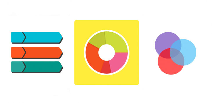
If a picture is worth a thousand words, the infographic is priceless. Strong infographics combine punchy, relevant written content with appealing graphics that paint a statistical picture or answer a specific question in multiple ways. With almost a third of brands using infographics or similar original images in their content as of 2016, it’s not enough to simply slip pictures in with your text anymore. Organizations must know how to use social media infographics to display the right data in the best way to engage users.
Here are three things you have to get right if you want your visual content to garner likes, shares and conversions.
The Right Infographic Format
Infographics come in various shapes, sizes and types, with some more common than others. The type of graphic you use depends on what information you’re providing and how you’re conveying it. Here’s a list of some of the most used social media infographics and what type of content to pair them with.
Maps
Maps let you show data about people and places visually. Typically, they involve colored regions or symbols on a recognizable map of the world, country, state or region. Use maps to show:
- Per-capita data
- Population data
- Comparative data related to regions
Timelines
Timelines provide information about events against a visual background that depicts time passing. Use timelines to show:
- The growth of a company
- Pare down a long story into bite-size text
- Illustrate how events led to a certain outcome
A Versus B
Some social media infographics compare two things (or more than two things). The infographic is often arranged in columns, with colors and opposing images used alongside text to show how two ideas, products or services are different. Use a comparative approach when you want to:
- Position one item as better
- Help readers make a choice between options
Charts and Graphs

Charts and graphs can be combined in a single infographic to help readers understand complex statistical data. Use charts and graphs when:
- You’re presenting a lot of data and text alone would bore readers
- You’re making a difficult logical or data-driven argument
- You want to illustrate some truly staggering statistics
Images with Stats or Facts
Many times, content providers simply want to provide a list of information or a bunch of related statistics. While you can list these in bulleted form, combining them with relevant images in an infographic sometimes appeals better to visual learners.
The Balance Between Info and Graphic
Infographics have both information and visual elements. If you can take the visual elements out of the graphic without impacting the meaning or communication, then all you really have is text on a nice background — that’s an effective content tool, too, but not an infographic.
Strive to create infographics so that text and images share equally in the communication task. That means choosing charts, icons and pictures that are related to the text. For example, if your content discusses how many trucks are required for each task, put an icon of a truck for every hundred or thousand vehicles required instead of one unrelated image of a vehicle.
Useful, Accurate Content
Finally, make sure all data conveyed in your infographic is useful and accurate. Source data from reliable sites and studies and never from someone else’s blog post. Trusting someone else to do the research for you can result in inaccurate claims and risk to brand trust. Readers might want to know where the information came from, so include citations at the bottom of your graphic when appropriate.

